Anthropic Economic Index report: Learning curves
Anthropic Economic Index за февраль 2026 года изучает использование Claude в экономике через приватную систему анализа Clio. В Claude.ai задачи диверсифицировались: доля топ-10 задач упала с 24% до 19%, а средняя почасовая «зарплата» задачи снизилась с $49.3 до $47.9 из-за роста бытовых запросов и миграции кодинга в API. Пользователи осознанно выбирают Opus для сложных и высокооплачиваемых задач: 55% задач категории Computer and Mathematical на платных аккаунтах Claude.ai идут через Opus против 45% образовательных. Опытные пользователи (6+ месяцев) на 7 п.п. чаще применяют Claude для работы, на 10% реже — для личных целей, и имеют на 10% более высокий уровень успешности диалогов даже после контроля за задачами и странами. Авторы (Maxim Massenkoff, Eva Lyubich, Peter McCrory и др.) интерпретируют это как свидетельство learning-by-doing, что может усилить skill-biased technological change и неравенство на рынке труда. Сходимость использования между штатами США продолжается, но медленнее, тогда как между странами разрыв слегка увеличился (топ-20 стран — 48% против 45%).
Anthropic Economic Index report: Learning curves

Anthropic Economic Index использует нашу систему приватного анализа данных, чтобы отслеживать, как Claude применяется в экономике. Это часть наших усилий понять экономические последствия AI как можно раньше, чтобы у исследователей и регуляторов было достаточно времени подготовиться.
Этот свежий отчёт изучает использование Claude в феврале 2026 года и развивает фреймворк экономических примитивов, представленный в нашем предыдущем отчёте (где использовались данные за ноябрь 2025 года). Наша выборка охватывает период с 5 по 12 февраля — спустя три месяца после релиза Claude Opus 4.5 и одновременно с выходом Claude Opus 4.6.
Сначала мы фиксируем, как изменилось использование по сравнению с предыдущими отчётами: доля augmentation — совместного взаимодействия, в котором AI дополняет способности пользователя, — слегка выросла как в Claude.ai, так и в трафике API. В Claude.ai использование стало более разнообразным: на топ-10 задач в прошлом месяце пришлась меньшая доля, чем в ноябре 2025 года. В результате этой диверсификации средний разговор в Claude.ai соответствовал задаче с чуть более низкой зарплатой по сравнению с предыдущими отчётами.
Затем мы сосредотачиваемся на важном факторе влияния Claude на рынок труда и экономику в целом — кривых обучения при освоении Claude. Мы приводим свидетельства того, что пользователи с большим стажем выработали привычки и стратегии, которые позволяют им лучше задействовать возможности Claude. Действительно, мы фиксируем, что более опытные пользователи не только берутся за задачи большей ценности, но и чаще получают успешные ответы в своих разговорах.
Что изменилось со времени нашего прошлого отчёта
В первой главе мы пересматриваем выводы нашего предыдущего Economic Index report, опубликованного в январе 2026 года. Мы обнаруживаем, что:
Сценарии использования в Claude.ai стали более разнообразными. Задачи по программированию продолжают переходить из augmentative-использования в Claude.ai в более автоматизированные рабочие процессы нашего first-party API.1 В этом отчёте использование Claude.ai было менее концентрированным: топ-10 задач составили 19% всего трафика в феврале против 24% в ноябре. При этом почти все задачи в этой выборке встречались хотя бы в одной из наших предыдущих выборок. Около 49% профессий получили выполнение по меньшей мере четверти своих задач с помощью Claude.Освоение Claude расширилось на задачи с более низкой зарплатой. По мере диверсификации сценариев использования средняя экономическая ценность работы, выполняемой через Claude, — измеренная по американским зарплатам работников соответствующих профессий — слегка снизилась. Это вызвано, механически, ростом числа личных запросов про спорт, сравнение товаров и обслуживание дома. Эта закономерность согласуется со стандартным сюжетом «кривой освоения», в которой ранние пользователи предпочитают конкретные высокоценные применения вроде кодинга, а более поздние берутся за гораздо более широкий спектр задач.Неравенство в глобальном использовании сохраняется. Использование остаётся сильно сконцентрированным: на топ-20 стран приходится 48% всего использования на душу населения — против 45%, что подчёркивает устойчивый разрыв в глобальном освоении. Однако использование Claude на душу населения внутри США продолжило сходиться: доля 10 штатов с самым высоким использованием снизилась с 40% до 38% со времени нашего прошлого отчёта.
Кривые обучения
Центральный вывод Economic Index — раннее освоение Claude очень неравномерно: Claude интенсивнее используется в странах с высоким доходом, внутри США — в местах с большей долей knowledge workers, а также для относительно небольшого набора специализированных задач и профессий.
Важный вопрос — как неравенство в освоении может определять, где и кому достанутся выгоды от AI. Если, например, эффективное использование AI требует комплементарных навыков и опыта — а мы аргументировали это в нашем предыдущем отчёте — и если такие навыки можно приобрести через использование и эксперименты, тогда выгоды от раннего освоения могут оказаться самоусиливающимися.
Во второй главе мы изучаем, как пользователи, по всей видимости, формируют ценность, которую извлекают из Claude: как они сопоставляют возможности модели с конкретной задачей и как паттерны использования и результаты меняются с опытом работы на платформе.
Выбор модели соответствует задаче. Мы показываем, что пользователи выбирают наш самый интеллектуальный класс моделей — Opus — для задач, которые обычно получают более высокую зарплату на рынке труда. Например, среди платных пользователей Claude.ai Opus применяется на 4 процентных пункта чаще среднего для задач программирования и на 7 процентных пунктов реже среднего для задач, связанных с репетиторством. У пользователей API эта переключаемость моделей примерно вдвое выраженнее.Больше стажа — выше успех. В целом, самые опытные пользователи Claude чаще применяют его для задач, требующих высшего образования, и реже — для личных сценариев. Например, у людей, использующих Claude 6 месяцев или дольше, на 10% меньше личных разговоров и на 6% выше уровень образования, отражённый в их вводах. Самое поразительное — у этой группы с большим стажем уровень успешности разговоров на 10% выше, и эта связь не объясняется ни выбором задач, ни страной происхождения, ни другими факторами. Это может отражать сложившуюся подготовленность ранних пользователей, но также может быть свидетельством learning-by-doing, когда люди учатся пользоваться Claude через опыт.
Что изменилось со времени нашего прошлого отчёта
Диверсификация сценариев использования в Claude.ai
Сначала мы смотрим на типы задач, которые поручают Claude. Мы используем нашу систему сохранения приватности, которая позволяет описывать поведение на агрегированном уровне, не раскрывая содержания отдельных стенограмм. Мы делаем выборку 1 миллиона разговоров как из Claude.ai — нашего веб-продукта для потребителей, — так и из нашего first-party API, интерфейса для разработчиков, который позволяет встраивать Claude в продукты и рабочие процессы.2
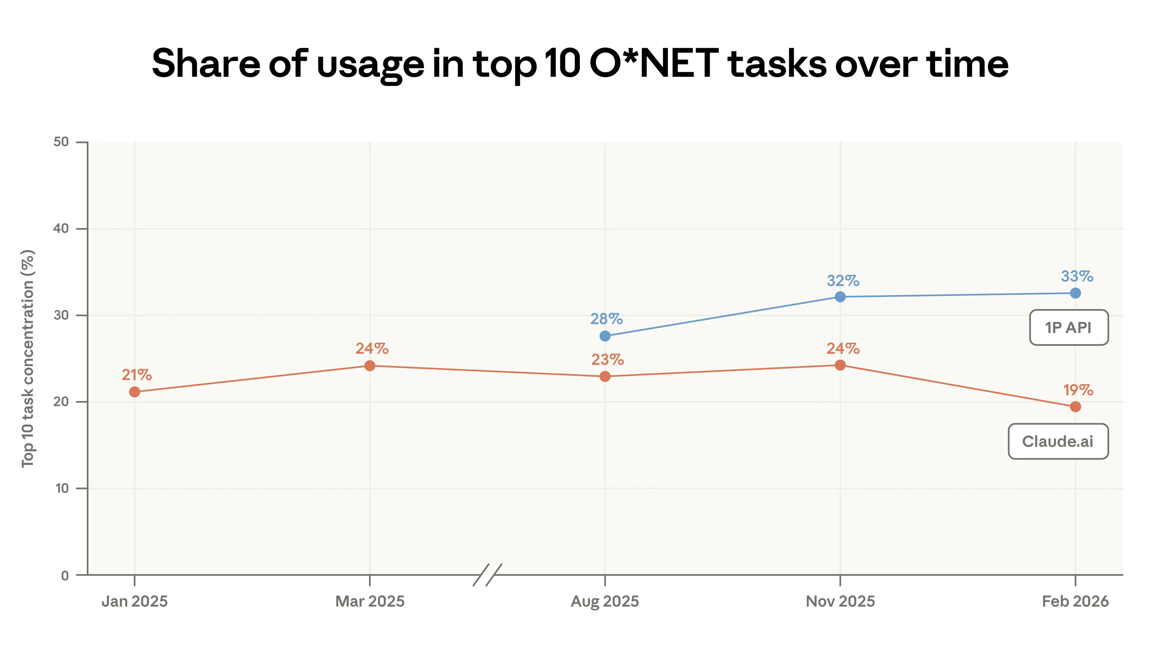
Кодинг остаётся самым распространённым применением на наших платформах: задачи, связанные с профессиями Computer and Mathematical, составляют 35% разговоров в Claude.ai (см. Appendix).3 Однако между ноябрём 2025 года и февралём 2026 года сценарии использования в Claude.ai стали менее концентрированными: топ-10 самых распространённых задач O*NET перешли с 24% разговоров до всего 19% (Figure 1.1).
Это снижение концентрации частично отражает миграцию задач программирования из Claude.ai в наш first-party API, где Claude Code вырос до значительной доли в нашей выборке трафика. Агентная архитектура Claude Code разбивает работу по кодингу на меньшие вызовы API, которые помечаются как отдельные задачи. Поэтому, хотя общая доля кодинга в трафике API выросла, она распределена по многим категориям задач, а не сконцентрирована в нескольких. В результате концентрация задач в API осталась примерно неизменной несмотря на приток активности по кодингу.
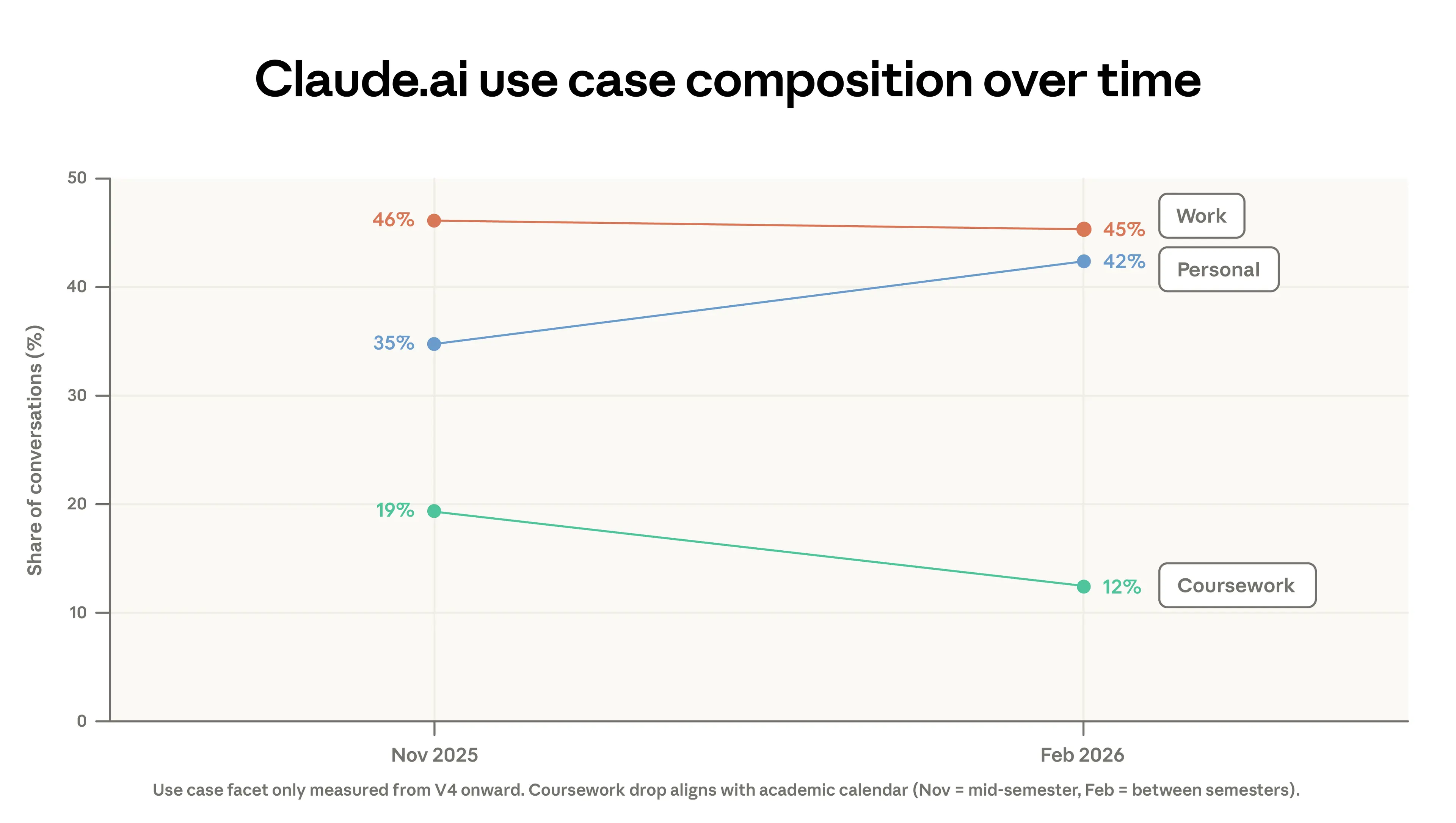
Эта миграция кодинга из Claude.ai — не единственный фактор снижения концентрации. Часть падения объясняется изменением состава сценариев использования между двумя периодами. Учебные задания сократились с 19% до 12% разговоров, а личное использование выросло с 35% до 42% разговоров. Часть падения учебных заданий можно объяснить академическими календарями в странах, где у студентов в наш период выборки были зимние каникулы.4 Одновременно растущее число регистраций примерно с февраля привело больше казуальных пользователей AI.
Хотя спектр рабочих задач Claude стал разнообразнее, почти все они уже встречались ранее в наших данных. В предыдущем отчёте мы отмечали, что 49% профессий получили выполнение по меньшей мере четверти своих задач с помощью Claude. В этой выгрузке данных эта совокупная оценка почти не изменилась (Appendix Figure A.2). Данные этого отчёта показали гораздо меньше новых задач O*NET, чем предыдущий отчёт.
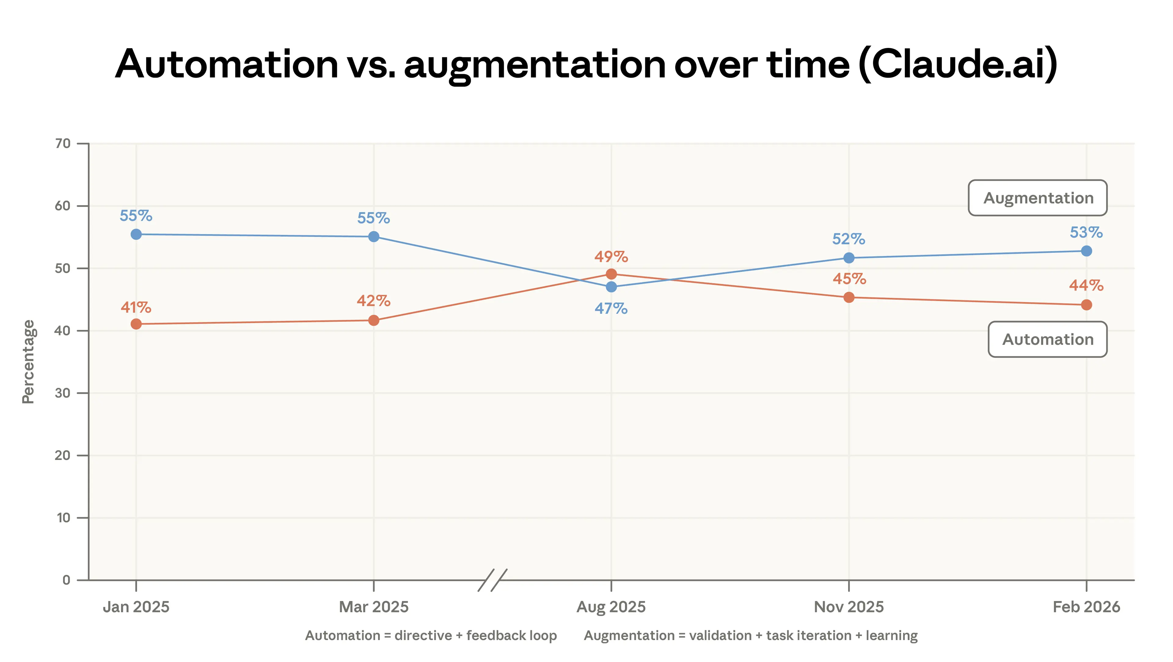
С нашего первого отчёта мы классифицируем разговоры на один из пяти типов взаимодействия — directive, feedback loop, task iteration, validation и learning, — которые мы группируем в две более широкие категории: automation и augmentation.5 Figure 1.3 показывает, что augmentation в Claude.ai слегка выросла. Это было обусловлено небольшими сдвигами в паттернах validation и learning. В Appendix Figure A.3 мы показываем, что automation резко упала в данных 1P API.
Наша платформа API продолжила набирать относительно более высокую долю задач Computer and Mathematical (доли использования по категориям профессий показаны в Appendix). С августа 2025 года доля задач этой категории выросла на 14% в API и снизилась на 18% в Claude.ai. Как мы отмечаем в нашем отчёте о labor market impacts, мы ожидаем, что эта миграция из Claude.ai в API может сигнализировать о более скорой трансформации работы для соответствующих профессий. Рост задач, связанных с профессиями Management, в Claude.ai с 3 до 5% трафика обусловлен сочетанием аналитических задач (например, подготовка инвестиционной записки) и ответов на вопросы клиентов.
Другой способ измерить изменение состава задач, выполняемых на Claude, — посмотреть на изменение средней ценности задач, которую мы определяем как среднюю почасовую зарплату американских работников, выполняющих эту задачу (Figure 1.4).6 Эта оценка ценности задач в Claude.ai слегка снизилась — с $49.3 до $47.9, — в основном из-за роста простых фактологических вопросов (например, спортивные результаты, погода) и снижения кодинга по мере его перехода в API. Как упоминалось в нашем предыдущем отчёте, задачи, которые мы видим в Claude, как правило требуют более высокого образования. График показывает, что эти задачи также обычно оплачиваются выше национального среднего по США.
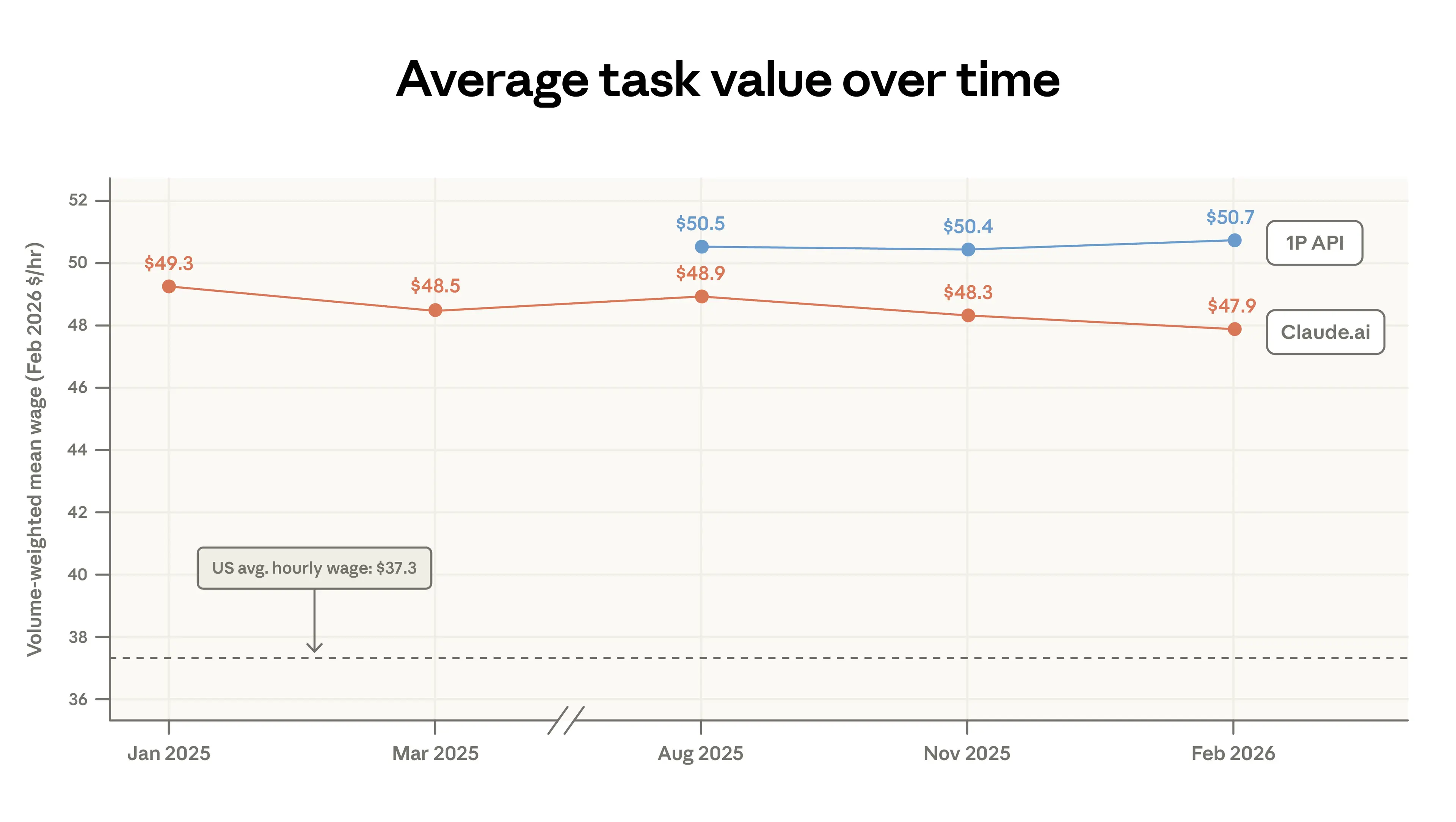
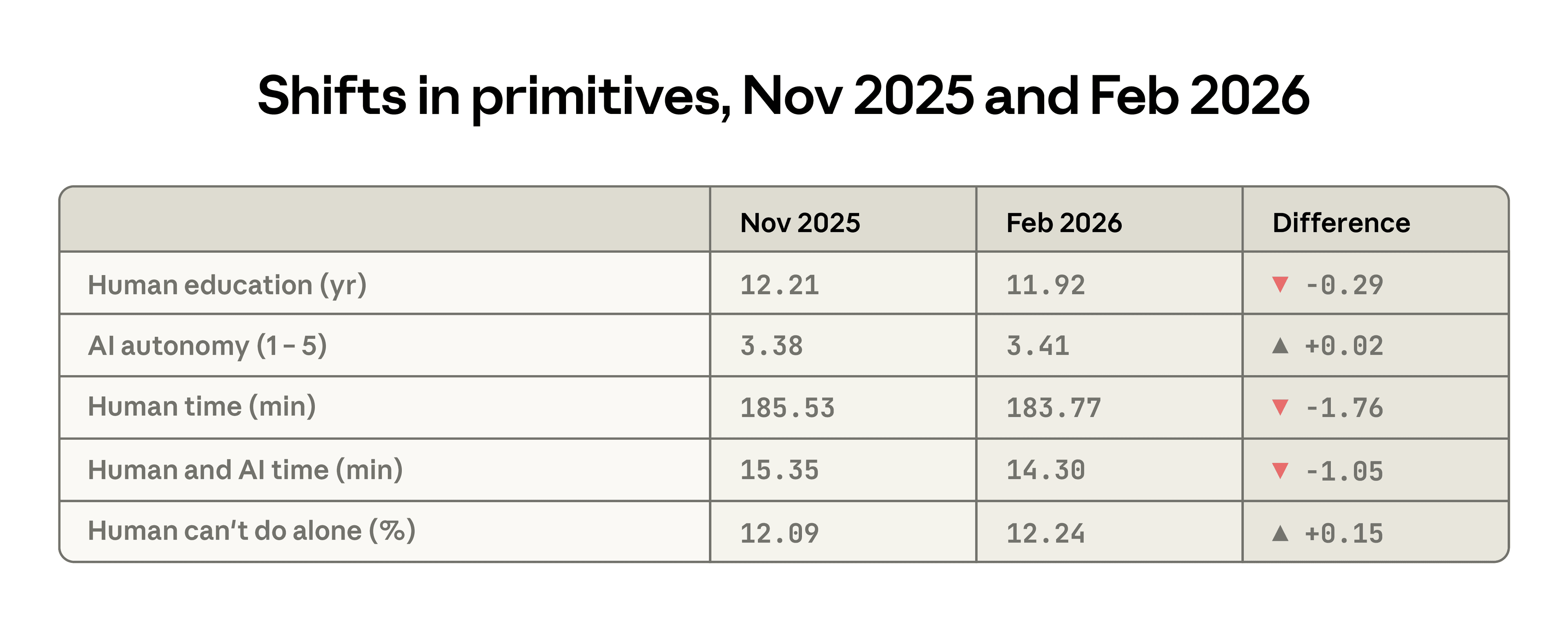
Пусть и небольшие, изменения нескольких примитивов между предыдущим и текущим отчётом фиксируют схожие снижения сложности задач в Claude.ai. Среднее количество лет образования, требуемых для человеческих вводов, снизилось с 12.2 до 11.9 лет, пользователи передавали AI больше автономии, а время, требующееся человеку на выполнение задачи в одиночку, сократилось примерно на 2 минуты. Одно изменение, на первый взгляд, идёт в обратном направлении: задачи, выполняемые Claude, были оценены как чуть менее выполнимые человеком без доступа к AI.
Появляющиеся паттерны автоматизации
По мере того как задачи мигрируют в API, они могут становиться более подверженными автоматизации. Рабочие процессы API гораздо чаще directive, с меньшей необходимостью держать человека в петле. В предыдущем отчёте мы подчёркивали, что задачи customer service — например, автоматизированная поддержка по вопросам оплаты и биллинга — распространены в данных API. Они привели к более высокой наблюдаемой подверженности Customer Service Representatives: Claude фиксировался за выполнением значительной доли их задач в автоматизированных рабочих процессах, так что эти профессии могут с большей вероятностью измениться по мере диффузии AI.
Мы выделяем два рабочих процесса API, которые в феврале встречались чаще, чем тремя месяцами ранее, — их доли в нашей последней выборке как минимум удвоились:7
Автоматизация продаж и аутрича для бизнеса: генерация sales enablement, B2B lead qualification research, обогащение клиентских данных, составление cold-email.Автоматизированный трейдинг и рыночные операции: мониторинг рынков или позиций, предложения конкретных инвестиций, информирование трейдеров о рыночной конъюнктуре и связанные задачи.
Возвращаясь к географической конвергенции
В предыдущем отчёте мы отмечали, что Anthropic AI Usage Index (AUI), который корректирует использование по работоспособному населению географии, быстро сходился между штатами США: штаты с изначально более низким использованием на душу населения показывали более быстрый темп освоения.
Левая панель Figure 1.6 показывает, что эта конвергенция продолжилась в наших самых свежих данных, но более медленным темпом. С августа 2025 года по февраль 2026 года доля использования на человека, приходящаяся на пять верхних штатов, снизилась с 30 до 24%. Коэффициент Gini падал с августа 2025 года, хотя темп конвергенции замедлился. Когда мы обновляем наши оценки из предыдущего отчёта, мы обнаруживаем, что при таких темпах штаты пришли бы к примерно равному использованию на душу населения через 5–9 лет, а не через 2–5.8
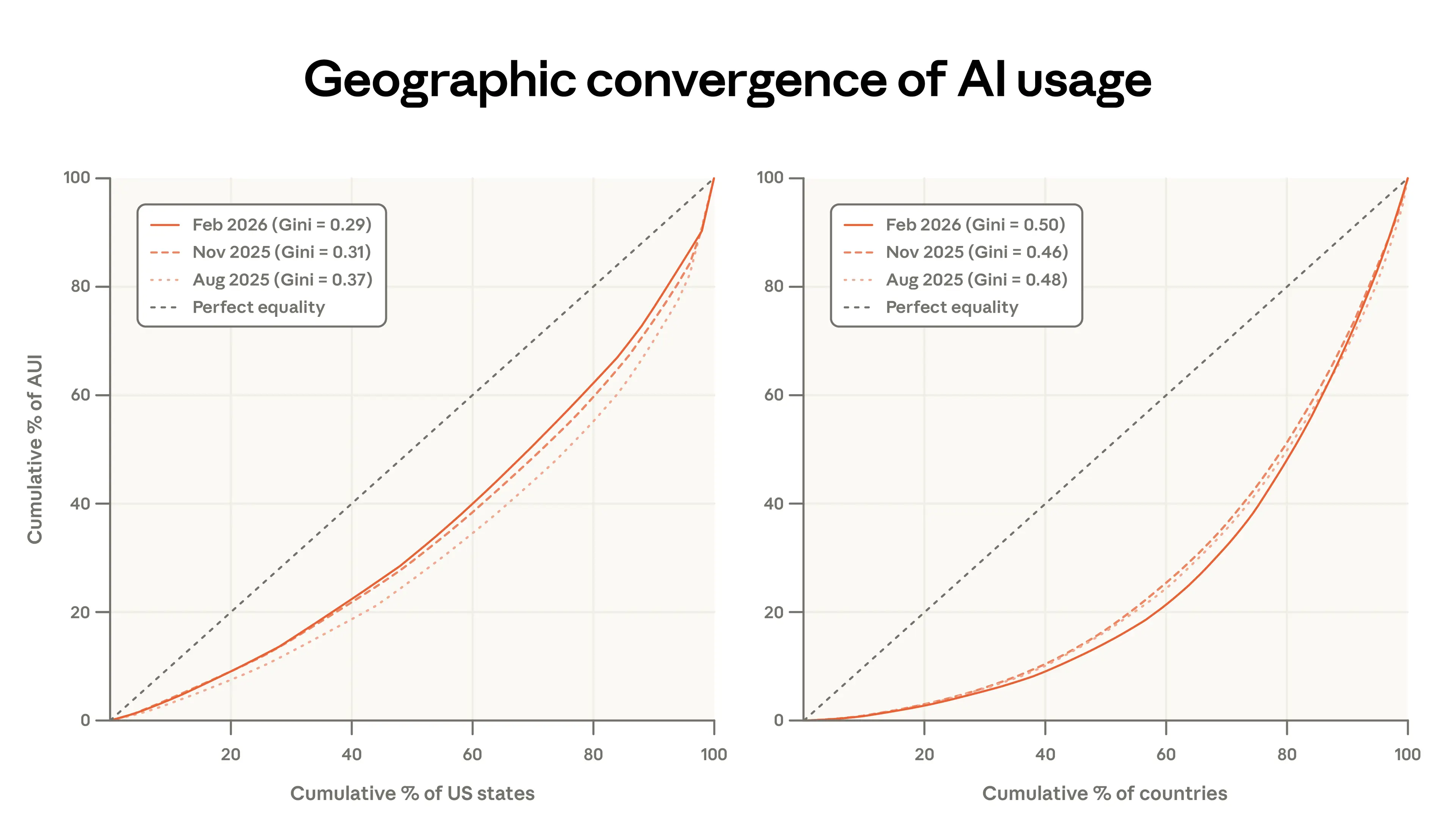
Между странами (правая панель) картина обратная: использование стало чуть более концентрированным, а Gini вырос за тот же период. Страны, чаще всего использующие Claude (на душу населения), теперь занимают большую долю общего использования: топ-20 стран перешёл с 45 до 48% использования, скорректированного на население.
Учимся пользоваться AI
В этой главе мы фокусируемся на двух особенностях использования, отражающих, как люди разворачивают AI и учатся работать с ним: выборе модели и привычках долгосрочных пользователей.
Сначала мы проливаем свет на спрос на интеллект, изучая, когда люди выбирают Opus — наш самый производительный класс моделей. Мало что известно о том, как пользователи AI выбирают между разными моделями, лавируя между скоростью, производительностью и стоимостью. Если пользователи калибруются под конкретную задачу, мы должны видеть, что Opus сконцентрирован на более сложной, высокоценной работе.
Далее мы изучаем, как использование различается в зависимости от стажа, находя различия между пользователями, зарегистрировавшимися в разное время. Это проливает свет на кривые обучения: становятся ли опытные пользователи лучше со временем? Чем отличается их использование? Мы находим свидетельства, согласующиеся с learning-by-doing. У пользователей с большим стажем не только выше успешность разговоров — они также больше сотрудничают с Claude, приносят Claude более сложные задачи и чаще используют его для рабочих целей и для более широкого спектра задач.
Выбор модели
Разные классы моделей Claude (Haiku, Sonnet и Opus) предлагают компромиссы по стоимости, скорости и производительности. Класс моделей Opus использует больше всего токенов и превосходит остальные на сложных задачах, но по более высокой цене за токен в нашем API. Если пользователи знают об этом и помнят о стоимости и лимитах использования, они должны приносить свои самые сложные и ценные задачи Opus, а для более простых задач выбирать другие модели. В целом это то, что мы наблюдаем в данных.
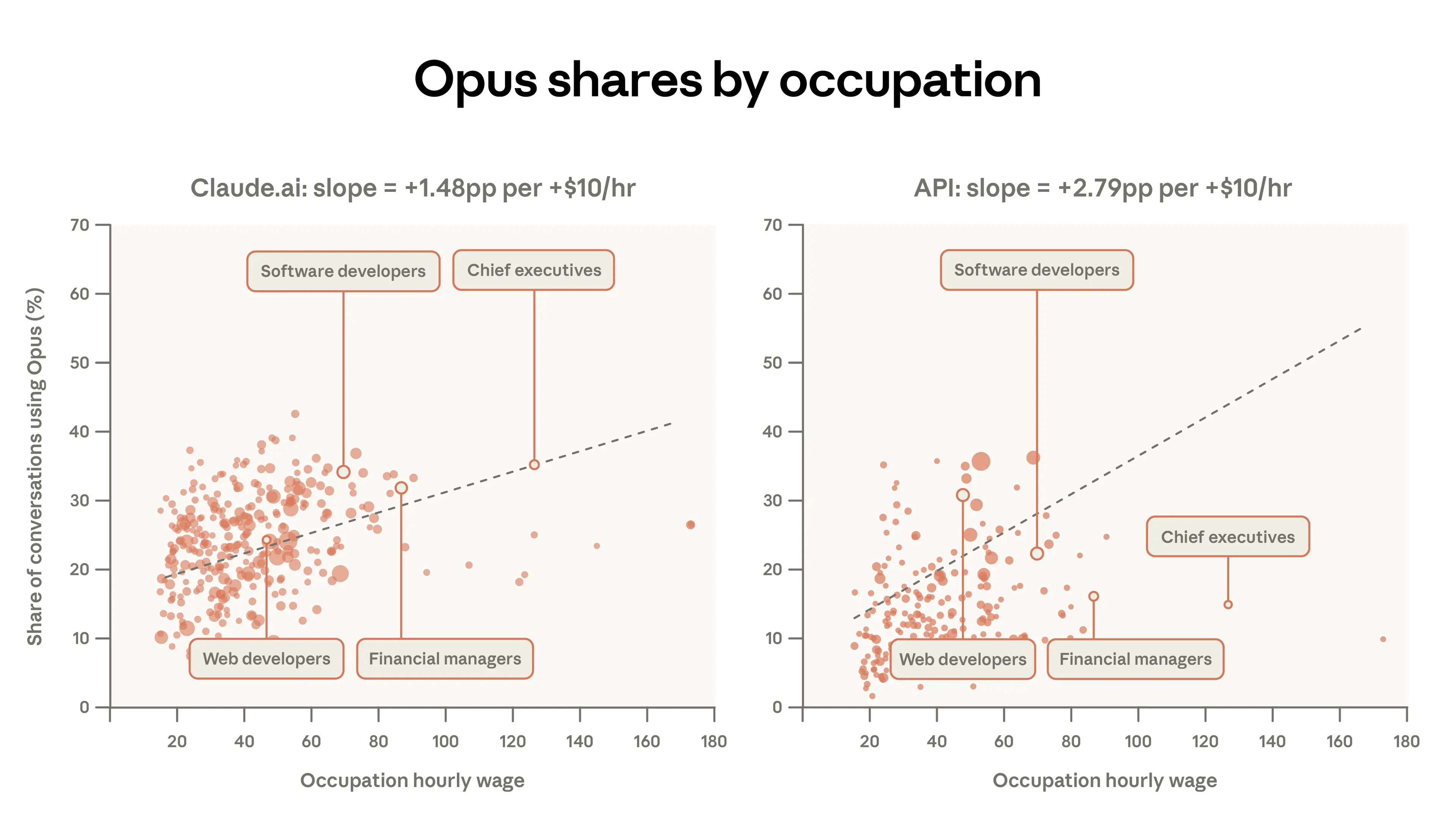
Figure 2.1 ниже показывает, что у платных аккаунтов Claude.ai, имеющих доступ ко всем классам моделей, 55% задач Computer and Mathematical (вроде программирования) выполняются на Opus против 45% задач Educational. Технические пользователи могут замечать выигрыш в производительности и активно переключаться с Sonnet — модели по умолчанию. Или же пользователи, заботящиеся об эффективности, могут учиться применять Sonnet для более простых задач, чтобы не упереться в лимиты. Связанно с этим, различия здесь могут отражать то, что большинство образовательных задач уже довольно просты для Sonnet, или то, что студенты с большей вероятностью помнят о лимитах использования.
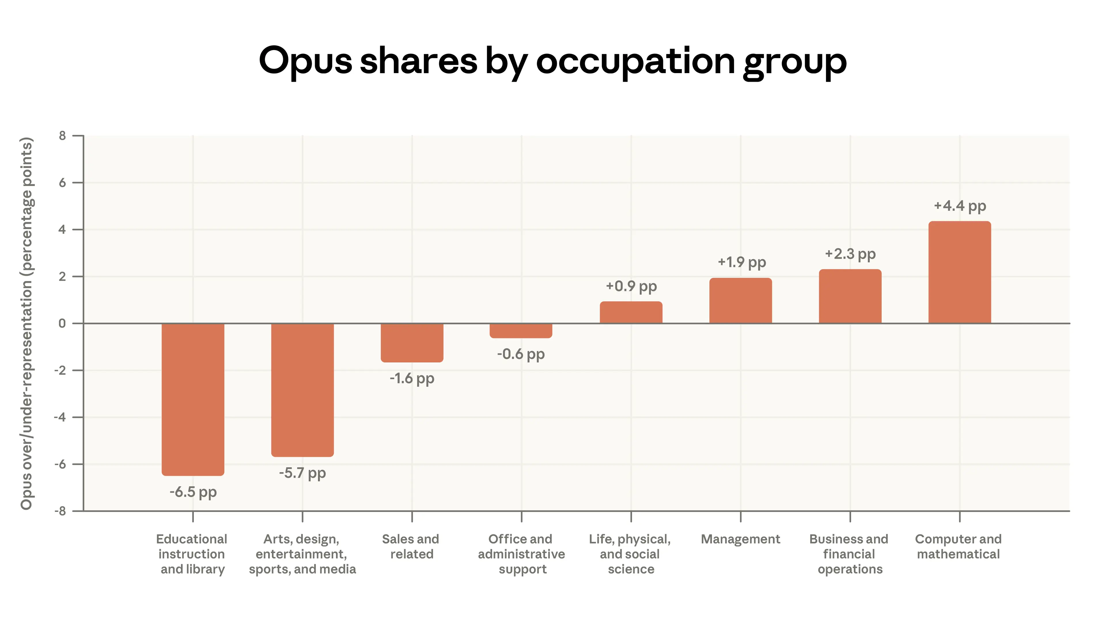
Figure 2.2 ниже показывает это более детально. Когда пользователи выполняют задачи, связанные с более высокооплачиваемыми профессиями, они чаще используют Opus. Например, в Claude.ai 34% задач Software Developer задействуют Opus против всего 12% задач Tutor. В целом, на каждые дополнительные $10 почасовой зарплаты задачи доля разговоров с Opus у пользователей Claude.ai возрастает на 1.5 процентных пункта. Трафик 1P API гораздо сильнее реагирует на сложность задачи. Его наклон примерно вдвое больше: доля Opus растёт на 2.8 процентных пункта на каждые $10 ценности задачи. У пользователей, разворачивающих программные рабочие процессы, может быть больше причин переключаться между моделями по сравнению с веб-пользователями.
Кривые обучения
Первая модель Claude вышла в марте 2023 года. С тех пор пользовательская база как в Claude.ai, так и в API быстро росла. Наша последняя выборка содержит разных пользователей — кто-то зарегистрировался ещё на первом релизе Claude, а кто-то — буквально за день до того, как мы измерили его использование. Как стаж работы с Claude формирует опыт пользователя?9
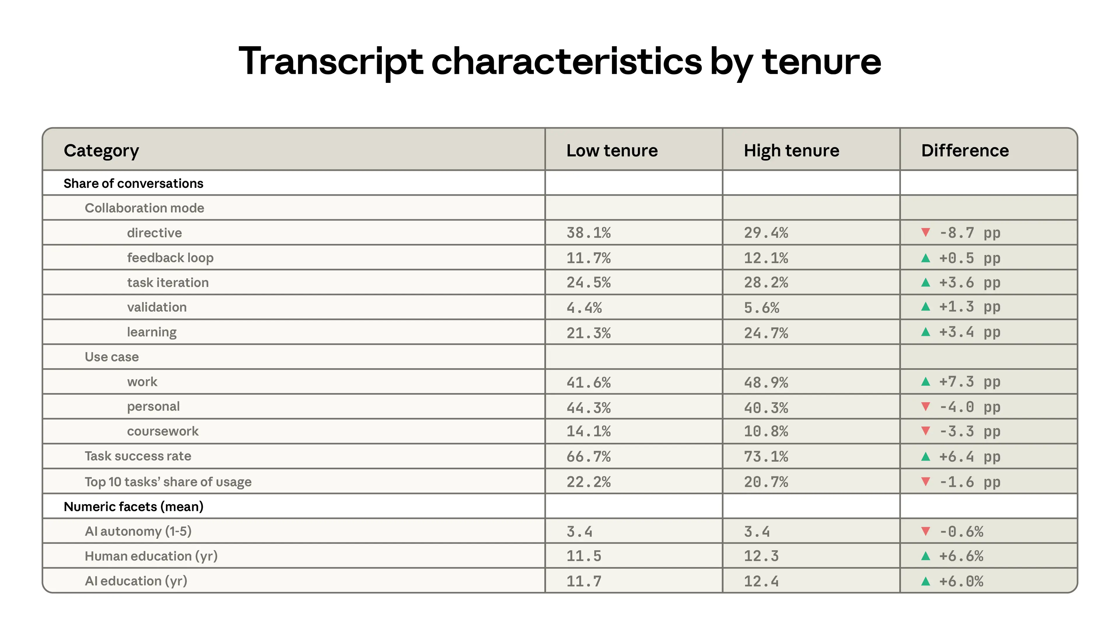
Table 2.1 показывает различия между пользователями с малым и большим стажем, где последние определяются как зарегистрировавшиеся в Claude не менее 6 месяцев назад, а пользователи с малым стажем — все остальные.10 Пользователи с большим стажем чаще применяют Claude для итерирования над своей работой и гораздо реже делегируют большую ответственность через directive-паттерны. Они на 7 процентных пунктов чаще используют Claude для работы и обращаются к Claude с задачами, которые, как правило, требуют более высоких уровней образования. Наконец, их использование менее сконцентрировано в определённых задачах. Топ-10 задач O*NET составляет чуть меньшую долю использования (20.7% против 22.2%) у группы с большим стажем.
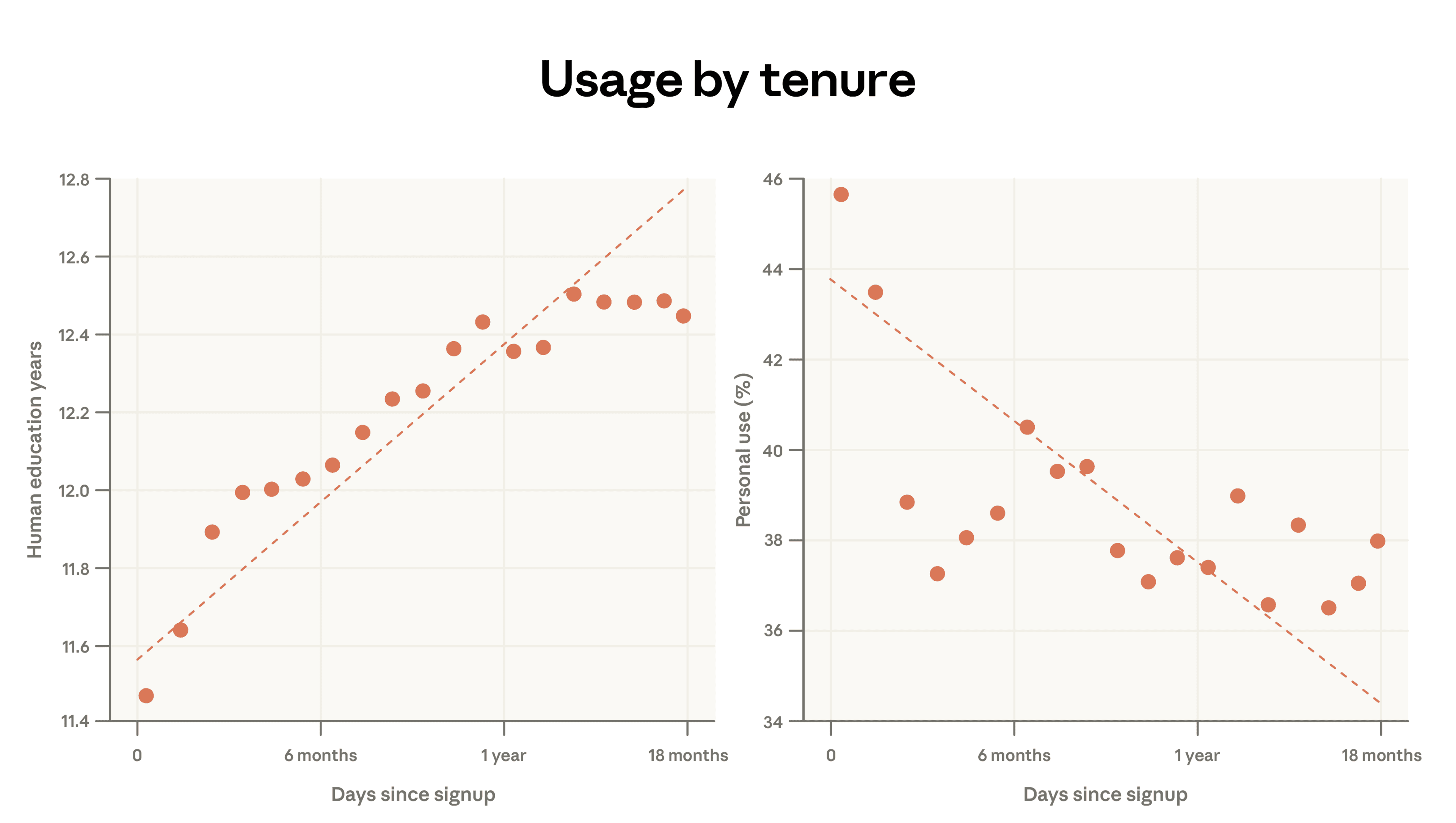
Ниже мы подробнее разбираем два из упомянутых выше примитивов: количество лет обучения, ассоциированных с каждым разговором, и долю стенограмм, посвящённых личному использованию.
На панели слева мы показываем, что количество лет обучения, нужных для понимания человеческого промпта, возрастает почти на 1 год на каждый дополнительный год использования Claude. На панели справа мы показываем, что одновременно личное использование снижается: люди, зарегистрировавшиеся год назад, отводят 38% своих разговоров под личные сценарии против 44% у самых новых пользователей.
Эти паттерны в пользовательской базе быстро развивающейся универсальной технологии могут объясняться несколькими факторами. Пользователи с большим стажем — самоотбор, и различия здесь могут отражать устойчивые характеристики. Они могут быть, например, программистами, которые с большей вероятностью оказались ранними пользователями. Кроме того, есть неустранимое смещение выживших: люди, зарегистрировавшиеся за год до нашей выгрузки данных, могут видеть положительные результаты от своего использования. Мы не наблюдаем тех, кто зарегистрировался год назад, но больше не пользуется Claude.
Выводы отражают то, что мы видели в нашем отчёте Economic Primitives: страны с более низким доходом и менее образованным населением парадоксально показывают более сложное использование в ряде случаев. Самые ранние пользователи часто имеют высокоценные технические сценарии. В более бедных странах с гораздо более низким уровнем освоения эти ранние пользователи всё ещё доминируют в пользовательской базе.
Более казуальное использование появляется тогда, когда AI распространился среди более широкой части населения. Действительно, среди кластеров запросов задачами с самым высоким средним стажем оказались: AI research, операции git, доработка рукописей и привлечение средств для стартапов. Задачами с самым низким средним стажем оказались более простые рабочие процессы вроде написания хайку, проверки спортивных результатов и предложений еды для вечеринки.11
Эффекты опыта
Мы детальнее исследуем эти связи в Figure 2.4 ниже, используя данные log-уровня, чтобы детально контролировать характеристики разговора. На верхней панели спецификация (1) показывает простую бивариатную регрессию с успешностью задачи в качестве исхода и индикатором большого стажа в качестве предиктора. Успешность — это оценка Claude того, был ли разговор успешным, описанная в нашем предыдущем отчёте. График показывает, что у пользователей с большим стажем примерно на 5 процентных пунктов выше вероятность успешного разговора.
Это может отражать то, что пользователи с большим стажем лучше составляют промпты. Но что если это отражает, что они приносят Claude другие задачи — те, у которых выше шанс быть успешными?
В спецификации (2) мы включаем фиксированные эффекты для конкретных задач O*NET и кластеров запросов. Это сводится к сравнению пользователей с большим и малым стажем внутри одной и той же узко определённой задачи, а не между задачами. Например, у нас есть кластер запросов под названием «Perform corporate financial analysis, valuation, and modeling for specific companies.» Фиксированные эффекты сравнивают пользователей с большим и малым стажем внутри этого кластера и аналогично внутри каждого другого кластера. Мы наблюдали бы положительный коэффициент только в том случае, если в среднем пользователи с большим стажем оказываются более успешными в этих внутризадачных сравнениях. Этот контроль несколько умеряет эффект, доводя его примерно до 3 процентных пунктов.
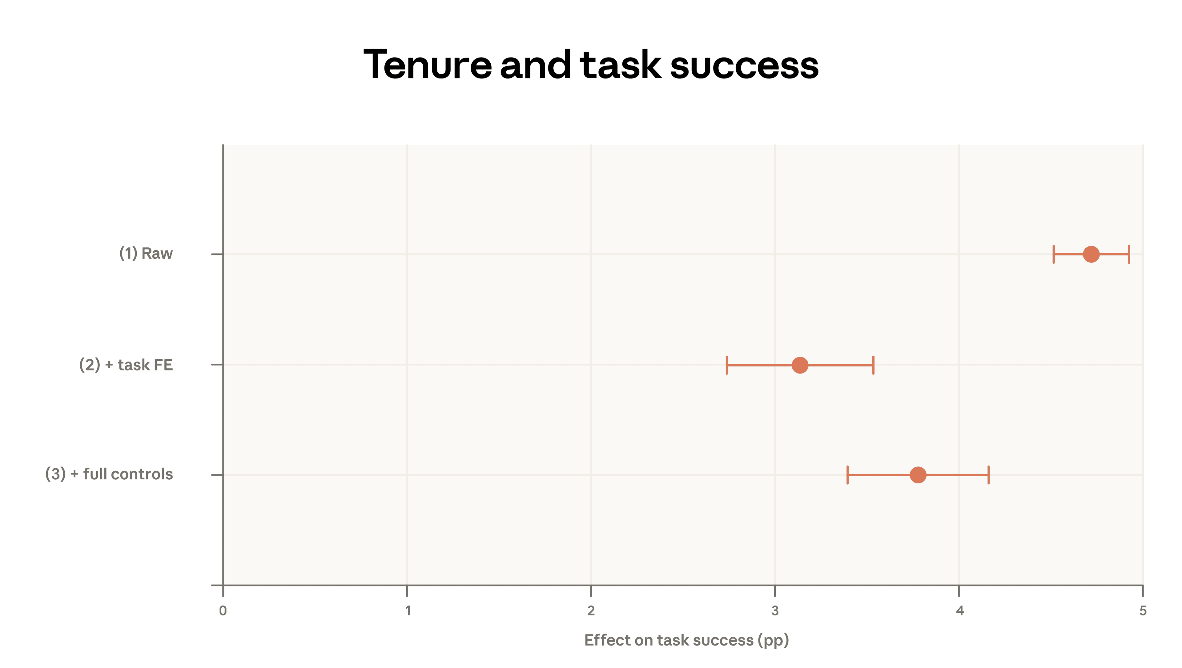
Наконец, мы спрашиваем, влияет ли на эту связь то, что пользователи с большим стажем выбирают другие модели, общаются на других языках, имеют другие сценарии использования или регистрируются в других странах. Эта регрессия даёт несколько более высокий эффект большого стажа, указывая на 4-процентный пункт более высокого уровня успеха с учётом полного набора контролей.
Эти результаты говорят о том, что пользователи с большим стажем добиваются большего успеха в своих разговорах с Claude и что это не объясняется простыми факторами вроде языка или выполняемой задачи. Одно интригующее возможное объяснение — что эти пользователи лучше научились извлекать из AI то, что им нужно. Уверенное владение этими платформами может быть ключевым фактором успеха, который, по всей видимости, растёт с опытом.
Обсуждение
Этот отчёт пересмотрел базовые метрики, которыми мы отслеживаем использование Claude, и впервые проанализировал выбор модели и успешность. С августа 2025 года использование 1P API стало более концентрированным: топ-10 задач O*NET теперь составляют 33% трафика — против 28%. Задачи Claude.ai, напротив, диверсифицировались по сравнению с нашими данными за ноябрь 2025 года. Более быстрое освоение среди штатов с низким использованием в США продолжилось, хотя и более медленным темпом, чем в предыдущем отчёте. Страны с низким освоением слегка отстали ещё больше.
С этим отчётом мы можем начать прослеживать, как изменялись различные экономические примитивы. Доля учебных заданий в использовании упала, а личных разговоров — выросла. Мы также отмечаем небольшое снижение совокупной сложности промптов в Claude.ai: разговоры в Claude.ai демонстрируют менее сложные вводы и более короткое расчётное время выполнения.
В целом Claude используется для высокоценной сложной работы, которая не широко репрезентативна для экономики США. Но по мере роста пользовательской базы менее оплачиваемые задачи заняли чуть бо́льшую долю трафика. Средняя ценность задач, измеренная как расчётная зарплата работников в профессиях, связанных с этими задачами, снизилась в Claude.ai с нашего первого отчёта и выросла среди пользователей API. На обеих поверхностях пользователи приносят свои самые сложные задачи к нашему более мощному классу моделей — Opus. Этот перегиб сильнее у клиентов API.
Более опытные пользователи, как правило, используют Claude более совместно, по более рабочим причинам, в более сложных задачах и с большей успешностью. Это опровергает гипотезу, которую мы выдвинули в прошлом году, — что автоматизированное использование может быть более типичным для более опытных и подкованных пользователей; вместо этого мы обнаруживаем, что самые продвинутые пользователи скорее итерируют с Claude. Это также согласуется с learning-by-doing: чем больше времени человек проводит, используя AI, тем эффективнее он становится в его задействовании.
Альтернативная интерпретация, разумеется, состоит в том, что эти результаты обусловлены когортными эффектами или смещением выживших. Ранние пользователи могут быть более техническими. Те, кто продолжает пользоваться Claude, могут быть теми, у кого задачи, для которых он особенно хорошо приспособлен. Но аккуратно контролируемые регрессии исключают простые варианты этого смешения — например, что пользователи с большим стажем приносят другие виды задач. Со временем мы сможем чище отделять когортный эффект и смещение выживших от learning-by-doing.
Эти наблюдаемые различия в уровнях успешности могут углубить неравенство на рынке труда. Экономисты давно отмечают потенциал skill-biased technological change: инноваций, которые повышают зарплаты высококвалифицированных работников и снижают их у остальных. Наш анализ в этом отчёте выделяет канал, через который такая skill-biased трансформация уже может разворачиваться: ранние пользователи с высококвалифицированными задачами получают более успешные взаимодействия с Claude, чем более поздние и менее технические пользователи. Эти ранние пользователи могут одновременно быть как самыми подверженными AI-driven disruption, так и наиболее выигрывающими от AI в этих начальных, augmentative волнах освоения.
Приложение
Доступно здесь.
Доступность данных
Данные этого отчёта доступны здесь.
Авторы и благодарности
Первый авторский блок*:
Maxim Massenkoff, Eva Lyubich, Peter McCrory
*Ведущие авторы отчёта
Второй авторский блок:
Ruth Appel, Ryan Heller
Благодарности
Tim Belonax, Keir Bradwell, Andy Braden, Dexter Callender III, Miriam Chaum, Madison Clark, Evan Frondorf, Deep Ganguli, Kunal Handa, Hanah Ho, Owen Kaye-Kauderer, Jennifer Martinez, Miles McCain, Jared Mueller, Kelsey Nanan, Tyler Neylon, Dianne Penn, Sarah Pollack, Ankur Rathi, David Saunders, Michael Stern, Alex Tamkin, Kim Withee, Jack Clark
Цитирование
@online{anthropic2026aeiv5, author = {Maxim Massenkoff and Eva Lyubich and Peter McCrory and Ruth Appel and Ryan Heller}, title = {Anthropic Economic Index report: Learning curves}, date = {2026-03-24}, year = {2026}, url = {https://www.anthropic.com/research/economic-index-march-2026-report}, }
Сноски
«First-party API», или 1P API, обозначает трафик разработчиков, идущий напрямую через собственный программный интерфейс Anthropic, что отличается как от потребительского приложения Anthropic Claude.ai, так и от сторонних платформ вроде Amazon Bedrock или Google Cloud Vertex.Сюда входят данные из Claude Code.Это число использует коды O*NET-SOC версии 2019 года, тогда как предыдущие отчёты использовали версию 2010 года.Падение разговоров про учебные задания составило 5 процентных пунктов в странах, где школьный семестр был активен, и 12 процентных пунктов в странах, где большинство студентов было на каникулах.Определения типов взаимодействия см. в Appendix.Например, задачу «Compute moisture or salt content, percentages of ingredients, formulas, or other product factors, using mathematical and chemical procedures.» выполняют только Food Science Technicians со средней зарплатой $26.15, так что это и есть ценность этой задачи. Источник данных для этого упражнения — May 2024 BLS Occupational Employment and Wage Statistics (OEWS) Tables. Когда несколько работников выполняют одну и ту же задачу, мы усредняем их зарплаты, взвешивая по занятости и доле времени, потраченного на задачу.Чтобы найти появляющиеся паттерны, мы отфильтровали задачи O*NET, которые (i) встречались не менее 300 раз в текущих данных и (ii) показали рост не менее чем в 2 раза по сравнению с предыдущим отчётом.Диапазон приведён, чтобы отразить разные оценки от запуска модели в нашем предыдущем отчёте с весами (5 лет) и без них (9 лет).В этом анализе мы используем данные log-уровня для оценки моделей с теми же порогами приватности. Подробнее о методологии см. в Appendix.Эти результаты схожи независимо от того, как мы определяем большой стаж.Наш период выборки совпал с релизом наших рекламных роликов на Super Bowl, которые привели множество впервые зарегистрировавшихся пользователей.
Связанные материалы
2028: Два сценария глобального лидерства в AI
Наши взгляды на конкуренцию в AI между США и Китаем.
Объясняя Claude «почему»
Новое исследование о том, как мы снизили агентное misalignment.
Natural Language Autoencoders: превращение мыслей Claude в текст
AI-модели вроде Claude говорят словами, но думают числами. В этом исследовании мы обучаем Claude переводить свои мысли в читаемый человеком текст.