
The Anthropic Economic Index report: New building blocks for understanding AI use
Anthropic представила четвёртый отчёт своего Economic Index, в котором вводит «экономические примитивы» — пять базовых измерений (сложность задачи, уровень навыков, цель использования, автономия ИИ и успешность), оцениваемых самим Claude по выборке разговоров за ноябрь 2025 года (преимущественно Claude Sonnet 4.5). Анализ показал, что Claude сильнее всего ускоряет более сложные задачи: на Claude.ai задачи, требующие школьного образования, ускорялись в 9 раз, а требующие диплома колледжа — в 12 раз, при этом успешность для сложных задач лишь немного ниже (66% против 70%). Claude чаще берёт на себя более высококвалифицированные задачи (в среднем 14,4 года образования против 13,2 в экономике), что при гипотетической автоматизации могло бы привести к эффекту «деквалификации» ряда профессий. С учётом надёжности задач прежняя оценка прироста производительности труда в США в 1,8 п.п. в год снижается примерно на треть — до 1,2 п.п. на Claude.ai и 1,0 п.п. на API. Использование Claude остаётся концентрированным: топ-10 задач дают 24% выборки, лидируют вычислительные и математические задачи, а augmentation (52%) вновь обогнала automation (45%).
Anthropic Economic Index: новые строительные блоки для понимания использования ИИ

Действительно ли искусственный интеллект ускоряет работу людей? Какие задачи ИИ поддерживает лучше всего? И как он может изменить характер профессий?
В Anthropic мы на постоянной основе измеряем реальное использование ИИ, чтобы отвечать именно на такие вопросы. Наш метод анализа, сохраняющий конфиденциальность, позволяет нам узнавать больше о разговорах на Claude.ai (отражая использование потребителями) и в нашем собственном API (в основном отражая использование бизнесом).1 В прошлых отчётах мы оценивали задачи ИИ по профессиям и уровню заработной платы, подробнее рассматривали разработку ПО и изучали использование ИИ по странам и штатам США.
Теперь мы добавляем новый уровень детализации в наш Economic Index. В нашем четвёртом отчёте мы вводим то, что назвали экономическими примитивами: набор из пяти простых, фундаментальных измерений для отслеживания экономического влияния Claude с течением времени. В наш первоначальный набор входят сложность задачи, уровень навыков, цель (работа, образование или личное использование), автономия ИИ и успешность.2 Мы выводим эти примитивы, прося Claude ответить на общий набор вопросов о каждом разговоре в нашей выборке для этого отчёта.
Эти примитивы дают опережающий индикатор потенциального экономического влияния ИИ — и позволяют нам отвечать на гораздо более сложные вопросы о том, как ИИ уже меняет рабочие места. Наш последний отчёт, в котором используется выборка разговоров за ноябрь 2025 года (преимущественно с использованием Claude Sonnet 4.5), применяет наши примитивы для изучения широкого круга вопросов, на которые мы иначе не смогли бы ответить, — включая то, как меняется уровень успешности Claude на уровне задач для более сложных задач, и может ли использование Claude на сегодняшний день предвещать эффект чистой деквалификации многих профессий.
Прочитать четвёртый отчёт Economic Index можно здесь. Ниже мы кратко излагаем его результаты.
Что мы узнали из наших экономических примитивов
Мы применили наши экономические примитивы к вопросам об отдельных задачах, профессиях, а затем о возможном совокупном влиянии наблюдаемых нами изменений. (Наша полная методология — включая детали того, как мы проверяли точность наших примитивов, — описана во второй главе полного отчёта.)
Задачи
Какие задачи ИИ ускоряет и насколько?
Мы обнаружили, что больше всего Claude ускоряет более сложные задачи. Мы измеряем это через оцениваемое Claude число лет обучения, необходимое для понимания входных данных разговора: на Claude.ai задачи с промптами, требующими школьного образования (12 лет), ускорялись в 9 раз, тогда как задачи, требующие диплома колледжа (16 лет), ускорялись в 12 раз. (На API ускорение было ещё больше.) Эти результаты подразумевают, что прирост производительности от ИИ в настоящее время накапливается в задачах, требующих относительно высокого человеческого капитала, что согласуется с данными о том, что офисные специалисты чаще используют ИИ на работе.
Эта же тенденция сохраняется — хотя и в более слабой форме — когда мы делаем поправку на уровень успешности задач. Claude успешно выполняет задачи, требующие диплома колледжа, в 66% случаев по сравнению с 70% для задач, требующих менее чем школьного образования. Это уменьшает, но не устраняет общий эффект: влияние Claude на ускорение задач растёт со сложностью более резко, чем сложность коррелирует со снижением успешности.

Каковы временны́е горизонты, на которых Claude может поддерживать задачи?
Измерение METR горизонтов задач ИИ показывает, что более длительные задачи труднее выполнять моделям ИИ. Но продолжительность времени, в течение которого модели ИИ могут работать, неуклонно растёт по мере того, как модели становятся лучше: этот показатель теперь стал ключевым индикатором прогресса ИИ.
Мы можем дополнить анализ METR с помощью наших экономических примитивов. На графике ниже мы показываем уровень успешности Claude на уровне задач относительно количества времени, которое человек потратил бы на ту же задачу, как на Claude.ai, так и на нашем API:
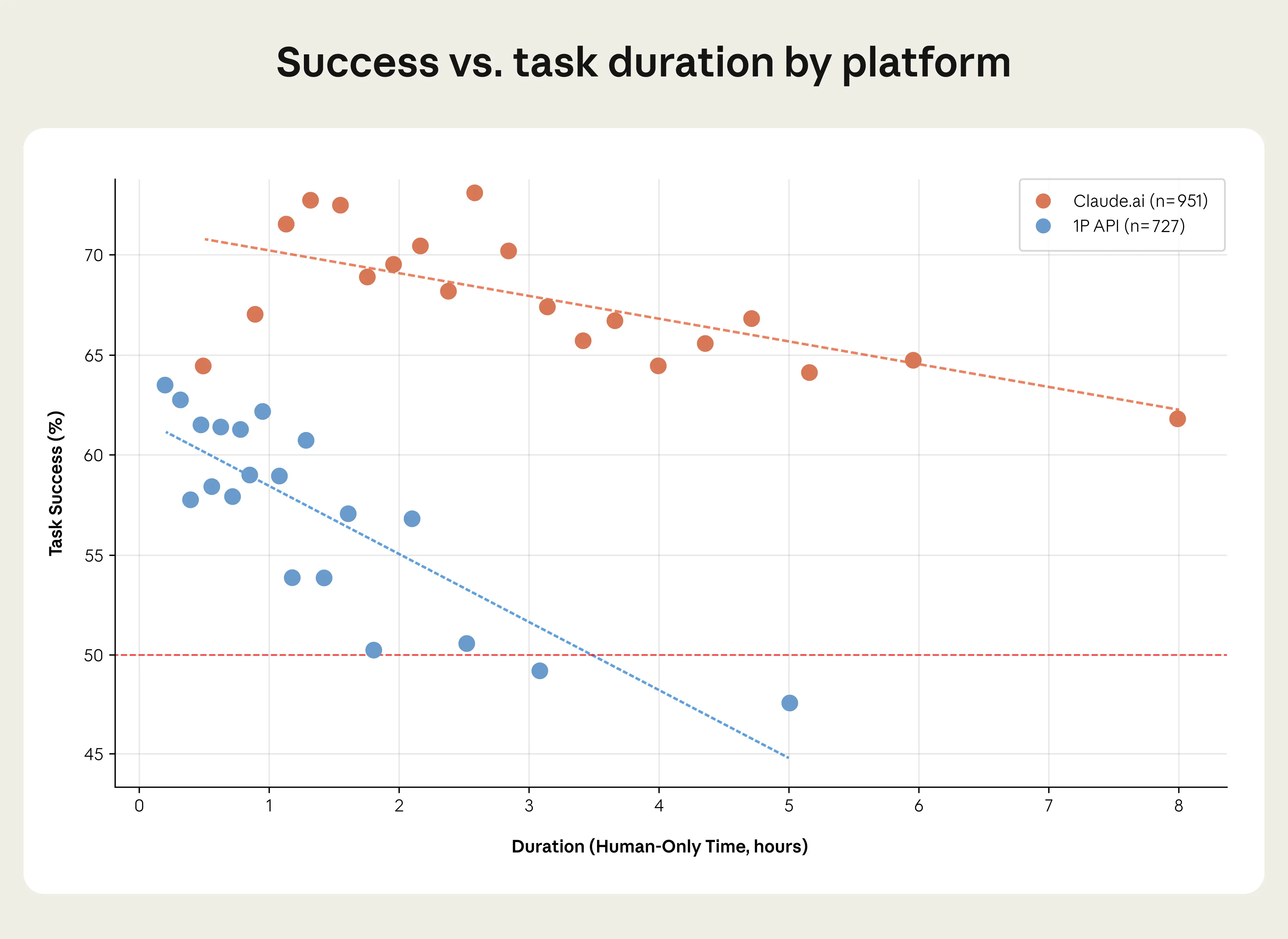
Бенчмарк METR предполагает, что Claude Sonnet 4.5 (модель в нашем собственном анализе) достигает 50%-ного уровня успешности на задачах продолжительностью 2 часа. Напротив, наши собственные данные по API показывают, что Claude на 50% успешен на задачах, которые занимают почти вдвое больше времени (около 3,5 часов), а на Claude.ai продолжительность значительно больше — около 19 часов. Но это может быть не таким противоречивым, как кажется: наша методология отличается от методологии METR в некоторых важных аспектах. В нашей выборке пользователи могут разбивать сложные задачи на более мелкие шаги, создавая обратную связь, которая позволяет Claude корректировать курс. И вместо фиксированного набора задач наша выборка содержит форму систематической ошибки отбора: пользователи приносят Claude задачи, в успехе которых они более уверены.
Наш анализ показывает, как эффективные временны́е горизонты Claude могут выглядеть иначе, чем те, что обнаружены в исследовании с постоянным набором задач. Мы будем отслеживать этот индикатор в дальнейших отчётах.
Как характер работы Claude различается по странам?
Мы обнаруживаем, что Claude выполняет совершенно разные виды задач в странах на разных стадиях экономического развития. В странах с более высоким ВВП на душу населения Claude используется гораздо чаще для работы или для личных целей, тогда как страны на другом конце спектра с большей вероятностью используют его для учебных занятий. Это укладывается в простой сценарий «кривой принятия», в котором страны с более низким доходом показывают большую долю использования ИИ в образовании и в меньшем числе рабочих задач, в то время как использование ИИ диверсифицируется в сторону личных целей по мере того, как страны становятся богаче.
Эти результаты согласуются с недавней работой Microsoft, которая связывает использование ИИ в образовании с более низким доходом на душу населения, а использование ИИ для досуга — с более высокими доходами. Наше недавнее партнёрство с правительством Руанды и ALX, провайдером технологического обучения, разработано с учётом этого: участники начинают с развития ИИ-грамотности, и мы пилотируем программу предоставления некоторым выпускникам годового доступа к Claude Pro, поддерживая переход от использования в образовании к более широкому кругу применений.

Профессии
Охват
В нашем первом отчёте, с данными за январь 2025 года, мы обнаружили, что в 36% профессий в нашей выборке Claude использовался как минимум для четверти их задач. При объединении данных по всем отчётам этот показатель вырос до 49%. Но как только мы учитываем уровень успешности Claude (который мы взвешиваем в зависимости от того, как часто работники выполняют данную задачу и сколько времени она занимает), мы получаем иную картину того, какие профессии больше всего затронуты использованием ИИ.
На графике ниже мы откладываем тот более ранний показатель охвата задач профессий по оси x, а наш новый, скорректированный показатель — по оси y. Хотя эти два показателя, безусловно, коррелируют, теперь мы обнаруживаем, что некоторые профессии (такие как операторы ввода данных и радиологи) затронуты ИИ гораздо сильнее, чем можно было бы предположить по одному лишь охвату задач, тогда как другие (такие как учителя и разработчики ПО) затронуты относительно меньше.

При этом даже наша пересмотренная оценка по-прежнему ограничена: мы оцениваем только задачи, выполняемые на Claude.ai, и не всегда ясно, как эти разговоры могут соотноситься с изменениями в реальном мире. Это область, которую мы планируем глубже изучить в будущем.
Содержание задач
Ещё один вопрос, который мы задали, — представляют ли задачи, охватываемые ИИ, более высоко- или низкоквалифицированные компоненты данной профессии. Используя создаваемую нами оценку уровня навыков, требуемого для каждой задачи, мы обнаруживаем, что Claude относительно чаще охватывает задачи, требующие более высокого уровня образования, — а именно задачи, требующие в среднем 14,4 года образования (эквивалент associate's degree в США), по сравнению со средним по экономике значением 13,2 (показано ниже). Это согласуется с нашим более ранним выводом о том, что Claude чаще используется офисными работниками.

В качестве эксперимента мы оценили, как удаление этих охватываемых Claude задач изменило бы состав задач в профессиях людей. В качестве эффекта первого порядка это в среднем деквалифицировало бы профессии, поскольку удалило бы те задачи, требующие более высокого образования. Были бы затронуты такие профессии, как технические писатели, турагенты и учителя (как мы подробнее обсуждаем в отчёте), хотя немногие более редкие (такие как управляющие недвижимостью) увидели бы эффекты, идущие в обратную сторону.
Мы не обязательно предсказываем, что эта деквалификация произойдёт: возможно, что даже если ИИ полностью автоматизировал бы задачи, которые он сейчас поддерживает, рынок труда динамически перестроился бы способами, которые этот анализ не учитывает. (Разумеется, по мере улучшения моделей будет меняться и состав задач, охватываемых ИИ.) При этом мы считаем, что это даёт полезный сигнал о наиболее непосредственных эффектах, которые ИИ может оказать на профессии в ближайшем будущем.3
Совокупное влияние
В нашем более раннем исследовании мы оценили, что широкое внедрение ИИ может увеличить рост производительности труда в США на 1,8 процентного пункта в год в течение следующих десяти лет — примерно вдвое больше трендового темпа. Наши новые примитивы позволяют нам пересмотреть этот анализ.
Основываясь только на наших оценках ускорения задач, мы воспроизвели наш более ранний вывод об увеличении на 1,8 процентного пункта (даже когда добавили данные по API). Но когда мы учитываем надёжность задач — то есть когда мы корректируем нашу оценку экономии времени на уровне задач на вероятность того, что задача успешна, — наша оценка падает примерно на треть для задач, выполняемых на Claude.ai (до 1,2 процентного пункта в год), и немного больше (до 1,0 процентного пункта) для обычно более сложных задач, выполняемых на нашем API.
Даже увеличение годового роста производительности труда на 1 процентный пункт было бы значимым: оно вернуло бы рост производительности в США к темпам конца 1990-х и начала 2000-х годов. И, как мы упоминали в нашем более раннем исследовании, эта итоговая оценка не учитывает возможности того, что модели ИИ станут гораздо мощнее или что использование ИИ на работе станет гораздо более изощрённым, — что могло бы поднять это число значительно выше. Действительно, со времени нашего обследования Claude стал существенно мощнее, с выпуском Claude Opus 4.5.
Обновления по нашим предыдущим показателям
Помимо наших примитивов, мы собрали новый раунд данных по показателям, которые отслеживали в предыдущих отчётах. Это позволяет нам выявить тенденции в использовании ИИ на протяжении 2025 года, с января по ноябрь. Здесь мы по большей части находим лишь небольшие изменения по сравнению с результатами предыдущих анализов, которые указывали на неравномерное распределение использования Claude.
Во-первых, мы обнаруживаем, что использование Claude осталось сильно сконцентрированным вокруг определённых задач: хотя наша выборка включает 3000 уникальных рабочих задач на Claude.ai, на топ-10 приходится 24% набора, что устойчиво выросло с 21% в январе 2025 года. Точнее, вычислительные и математические задачи продолжают доминировать в использовании Claude: они составляют около трети всех разговоров на Claude.ai и почти половину нашего трафика API.
Во-вторых, наш новый отчёт показывает, что augmentation (52% разговоров) обогнал automation (45%) в качестве самого популярного паттерна взаимодействия с Claude на Claude.ai. Это разворот того, что мы видели в нашей августовской выборке (когда automation лидировал со счётом 49% против 47%), но, когда мы оцениваем этот вопрос на более длительном временном отрезке, мы всё же видим медленный рост доли automation в задачах: augmentation лидировал со счётом 55% против 41% в январе прошлого года и 55% против 42% в марте.
В-третьих, наш последний анализ показывает, что географическая концентрация использования ИИ (которую мы обсуждали в прошлый раз) остаётся очевидной. США, Индия, Япония, Великобритания и Южная Корея по-прежнему лидируют по общему использованию Claude.ai, и принятие по-прежнему хорошо объясняется ВВП на душу населения. При этом в США мы наблюдали более заметные изменения: использование Claude стало заметно более равномерно распределённым по штатам США. Фактически, если бы эта тенденция сохранилась, наша модель предсказывает, что использование Claude выровнялось бы по всей стране в течение двух-пяти лет. Мы обсуждаем эту модель более подробно в отчёте.
Заключение
Самый непосредственный вывод из нашего последнего отчёта Economic Index состоит в том, что влияние ИИ на глобальную рабочую силу остаётся крайне неравномерным: использование ИИ по-прежнему сконцентрировано в определённых странах и профессиях, и оно затрагивает одни профессии совершенно иначе, чем другие, как показывают данные об охвате задач.
В более общем плане этот отчёт дал нам новую базовую точку, с которой можно сравнивать наши будущие обследования. По мере того как Claude совершенствуется, мы ожидаем, что его будут просить браться за более сложные задачи и что он, вероятно, будет добиваться большего успеха. Мы также ожидаем, что задачи могут перемещаться с Claude.ai в API (то есть преимущественно от потребителей к преимущественно бизнесу) по мере того, как они становятся более надёжными, — и если это произойдёт, это даст нам ещё один возможный индикатор грядущего экономического влияния, учитывая важность принятия бизнесом для влияния ИИ на производительность. Через наши примитивы мы сможем измерять, как подобные изменения начинают влиять на реальные результаты, включая характер работы людей, и какие люди (и где) с наибольшей вероятностью будут затронуты сильнее всего в этот период быстрого технологического перехода.
А пока исследователи, журналисты и общественность могут использовать наши данные для своих собственных исследований и размышлений, а также чтобы создать эмпирическую основу для возможных политических мер, которые нам могут понадобиться. Гораздо больше деталей по каждой из областей, которые мы обсудили выше, см. в нашем полном отчёте.
Сноски
Как и в предыдущих отчётах, весь наш анализ основан на анализе, сохраняющем конфиденциальность. На протяжении всего отчёта мы анализируем случайную выборку из 1 млн разговоров из планов Claude.ai Free, Pro и Max (мы также называем это «потребительскими данными», поскольку они в основном отражают потребительское использование) и 1 млн стенограмм из трафика нашего собственного (1P) API (мы также называем это «корпоративными данными», поскольку они в основном отражают корпоративное использование).Точнее, Сложность задачи отражает то, что задачи могут различаться по своей сложности, включая то, сколько времени они занимают и насколько они трудны. Задача «отладки» в O*NET может означать как исправление Claude небольшой ошибки в функции, так и комплексный рефакторинг кодовой базы — с очень разными последствиями для спроса на труд. Мы измеряем сложность через оцениваемое время человека на выполнение задач без ИИ, время, затраченное на выполнение задач с ИИ, и то, обрабатывают ли пользователи несколько задач в рамках одного разговора.Человеческие и ИИ-навыки касаются того, как автоматизация взаимодействует с уровнями навыков. Если ИИ непропорционально замещает задачи, требующие меньшей экспертизы, дополняя при этом более высококвалифицированную работу, это может быть ещё одной формой технических изменений, смещённых в пользу навыков (skill-biased technical change), — повышая спрос на высококвалифицированных работников и вытесняя менее квалифицированных. Мы измеряем, могли ли пользователи выполнить задачи без Claude, и количество лет образования, необходимое для понимания как промптов пользователей, так и ответов Claude.Сценарий использования различает профессиональное, образовательное и личное использование. Эффекты для рынка труда наиболее прямо следуют из использования на рабочем месте, тогда как образовательное использование может сигнализировать о том, где будущая рабочая сила формирует навыки, дополняющие ИИ.Автономия ИИ измеряет степень, в которой пользователи делегируют принятие решений Claude. Наш последний отчёт задокументировал растущее «директивное» использование, при котором пользователи делегируют задачи целиком. Отслеживание уровней автономии — от активного сотрудничества до полного делегирования — помогает прогнозировать темп автоматизации.Успешность задачи измеряет оценку Claude того, успешно ли Claude выполняет задачи. Успешность задачи помогает оценить, могут ли задачи быть автоматизированы эффективно (можно ли вообще автоматизировать задачу?) и продуктивно (сколько попыток потребуется, чтобы автоматизировать задачу?). То есть успешность задачи имеет значение как для осуществимости, так и для стоимости автоматизации трудовых задач.Действительно, некоторые исторические данные предполагают, что когда технологии, автоматизирующие рабочие задачи, появляются в патентных данных, занятость и заработная плата впоследствии падают для подверженных воздействию профессий.
Связанный контент
2028: два сценария глобального лидерства в ИИ
Наши взгляды на конкуренцию в области ИИ между США и Китаем.
Обучая Claude «почему»
Новое исследование о том, как мы снизили агентную рассогласованность (agentic misalignment).
Natural Language Autoencoders: превращаем мысли Claude в текст
Модели ИИ вроде Claude говорят словами, но думают числами. В этом исследовании мы обучаем Claude переводить свои мысли в понятный человеку текст.